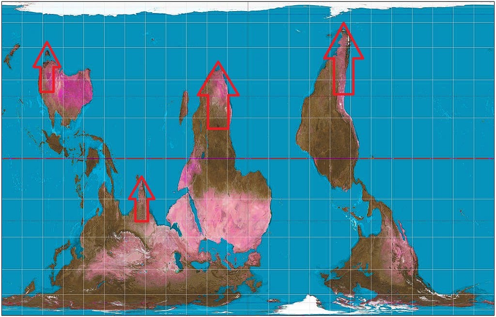
This first one simply highlights how all the landmasses of the Earth seem to point south. I heard someone mention this strange fact quite a while ago and it struck me as quite odd. It's one of those strange things you only ever really notice when someone points it out to you.

(Gall-Peters projection with arrows
highlighting the southward pointing continents)
When you flip the map upside down the effect seems to become even more noticeable.
(Gall-Peters projection - upside down)
Now still after all this time I have no idea why the landmasses seem to point south. Is there some reason for this? Or is it simply something random we're seeing in the map that isn't really as significant as it appears.
Of course, the Gall-Peters projection does seem to elongate the continents quite a bit (no doubt why I originally used it to illustrate the point). So maybe this south-pointing tendency isn't quite as pronounced in reality as it appears on the map. It's still rather odd though whichever map you use.
Also another noticeable thing is that at the northern extreme of the map the land is almost continuous (right across Russia, Canada and Alaska with just a few blips of ocean separating Greenland). However, at the southern extreme it's just the tips of the landmasses (if we discount Antarctica of course). We're all so familiar with the world map that we just seem to accept this weird land distribution, but when we look at the less familiar upside image it becomes impossible not to notice.
It reminds me a little of the land and water hemispheres of the Earth, which show that the Earth can be divided into two halves - one containing most of the landmasses and the other containing mainly water (with just Australia, New Zealand, the tip of South America, Indonesia and Antarctica disturbing an otherwise endless ocean).
The British Empire on the Azimuthal Equidistant Map
This next map kind of ties in with the first one in a way, and once again concerns the tips of the continents. I noticed that if you marked the British Empire on the world map then it seemed that Britain controlled most of the edge.
So if you view this image you'll see that Britain had possession of New Zealand, Australia, India and South Africa. Pretty much half the perimeter.

(The Anglo-Sphere on the Azimuthal Projection)
Now, of course, the anomaly here is that South America was never part of the British Empire. However, what were part of the British Empire, and still are part of Britain's overseas territories, are the Falkland Islands - right at the tip of South America. Quite interesting really, as it suddenly gives the Falklands a more strategic and valuable purpose.
Now the final circled area, in the middle of the Pacific Ocean, is Hawaii. Now the fiftieth state of the USA. Although not quite on the outer perimeter line it seemed worth including at the time as it seems to have a lot of importance for some reason. Perhaps simply owing to it being the only large island group in that vast swathe of ocean. It's also very much part of the "Anglosphere". In fact, both Britain and the US had a huge interest and involvement in the governance of Hawaii long before it formally joined the USA. The British influence can be seen in the design of the Hawaiian flag.

(The flag of Hawaii containing the Union Jack)
Again, just like the previous map, I have no real explanation for this "British" perimeter, and it could likewise just be another random anomaly that seems to suggest something that isn't really there. Plus we, the British, did control a large part of the world anyway. So I guess countless other patterns could also be etched out on to the world map in that regard.
Either way though I do find both these maps quite interesting and thought-provoking.
No comments:
Post a Comment